Modify Attributes
You can adjust the properties of tools and selected objects using the Attributes Panel, located just below the toolbar. Available options vary depending on the selected tool or object. Common attributes include:
Position
Drag selected objects on the canvas to move them. For precise adjustments, use the arrow keys on your keyboard.
Line and Border

Adjust the stroke properties of lines and shapes:
- Dash Style: Choose a solid or dashed line pattern.
- Enable/Disable: Toggle the line or border on or off.
- Fill Type: Choose between a solid color or a gradient.
- Color/Gradient: Set the stroke color or gradient. See Choose a Color and Choose a Gradient.
- Width: Set the line thickness in pixels.
- Arrow Style: Add arrowheads to the start or end of a line.
- Line Cap: Define the shape of the line endpoints (e.g., butt, round, square).
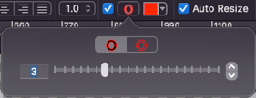
Outline

Add an outer stroke to lines, curves, and paths:
- Enable/Disable: Toggle the outline on or off.
- Width: Set the outline thickness in pixels.
- Color: Set the outline color.
Tips
If you enable the outline and set the main line color to transparent, you will create a hollow line.
Fill

Adjust the interior color of shapes:
- Enable/Disable: Toggle the fill on or off.
- Fill Type: Choose between a solid color or a gradient.
- Color/Gradient: Set the fill color or gradient.
Smooth (Anti-aliasing)

Enabled by default, this applies anti-aliasing to smooth the edges of lines, borders, and text. It is recommended to keep this enabled for better visual quality.
Corner Radius

Available for rounded rectangles. Adjust the curvature of the corners:
- X: Horizontal radius (in pixels).
- Y: Vertical radius (in pixels).
Text

Format text objects with the following options:
- Font: Choose the font family.
- Style: Apply bold, italic, or other font styles.
- Size: Set the font size in pixels.
- Fill Type: Choose a solid color or gradient for the text.
- Color/Gradient: Set the text color.
- Alignment: Align text to the left, center, right, or justify.
- Spacing: Adjust line height and paragraph spacing.
- Text Outline: Add a stroke around the text characters. Click the details button to adjust the outline width and color.
- Auto Resize: When enabled, the text box automatically adjusts its size to fit the content. When disabled, the text box size is fixed, and you can resize it manually.
Tips
Text boxes also support standard Border and Fill attributes, allowing you to add a background color or frame to your text.
Shadow

Toggle the shadow effect on or off, and click the shadow button to open the detailed settings panel.
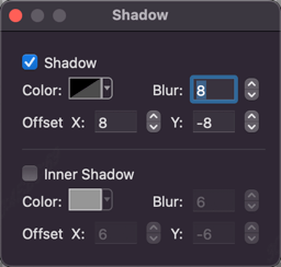
You can apply a standard Drop Shadow or an Inner Shadow.
Note: Inner shadows require the object to have a Fill. Lines and unfilled shapes cannot display inner shadows.
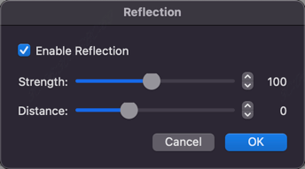
Reflection

Toggle the reflection effect on or off, and click the reflection button to adjust its opacity and distance.